In the news this summer was an interesting bit about the Navy doing away with touchscreen controls on its destroyers. Sailors complained that the digital interfaces were too complex and confusing, and investigators blamed the touchscreens for collisions involving the USS Fitzgerald in June 2017 and the USS McCain in August 2017. These collisions led to the deaths of 17 sailors.
Subsequent investigations revealed that sailors much prefer manual controls such as wheels and throttles. According to Wired magazine: “The problems with the touchscreens seem to result from a deadly triumvirate: bad design, bad testing and bad training.”
That ought to be a warning shot (across the bow?) to anybody involved in the design or operation of heavy equipment, trucks and vehicles.
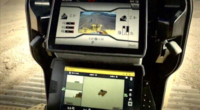
Touchscreens are now found on every piece of new equipment and every vehicle sold today. I understand why OEMs like them. You can put more functionality on a touchscreen than you can on 100 levers, wheels or push buttons. Add in GPS navigation, hands-free phone access and GPS machine automation graphics (on earthmoving equipment) and you’ve got the kind of functionality nobody even dreamed of 10 years ago.
But when it comes to vehicles that barrel down the highway at speeds in excess of 70 mph, and that includes everything from dump trucks to pickup trucks, I think the OEMs need to revisit their designs for these interfaces.
About a year ago, I bought my first new car in a long time, a sedan, but it has the same basic interface for climate controls and radio as most trucks. The problem is the controls for the radio on/off and volume, the AC/heat on/off and fan speed, the engine start/stop button and the trunk-open button are all the same size and same shape. You have to look away from the windshield to read the small white lettering on the button to know which one you’re pushing. To select a radio station, you have to go through a touchscreen tap dance that again takes away from windshield time. And the temperature controls force you to find a tiny +/- sign that floats around out there in this sea of buttons.
In every previous car I’ve owned or driven (since 1967), these controls were always in the same place and always accessible without having to take your eyes off the road. The radio was controlled by two knobs, between them was a row of buttons for station preselects. The climate controls were three sliding levers. They were tactile and analog and with few variations always in the same place. You could find them blindfolded, even in otherwise quirky British and Italian sports cars.
But in today’s vehicles, accessing any of those functions means taking your eyes off the road. With all the noise about distracted driving and cellphones, automotive OEMs should not let the digital whiz-bang features take precedence over tried-and-true analog/manual features. Technology should make our vehicles, and equipment, safer, not less so.
Hands-free phone access and GPS navigation are great. The rest of these dashboard and console components should be able to pass the blindfold test.


