


A growing product line and competitor imitation were two major factors in the recently unveiled redesign of the Caterpillar trade dress, the combination of logo and styling that the company uses to brand its machines and other products. This is according to Ed Stembridge, product identity manager at Cat and the leader of the design team behind the new product styling.
Stembridge discussed the new product styling and the process of its development during an interview with Equipment World in the days following its reveal.
As a 17-year veteran of the company well-versed in its both its history and the strides it has taken into the digital age, Stembridge is uniquely suited to lead something as critical as dreaming up a new look for the company’s heavy equipment and variety of other products. He also led the team behind the last trade dress redesign, developed between 2005 and 2006.
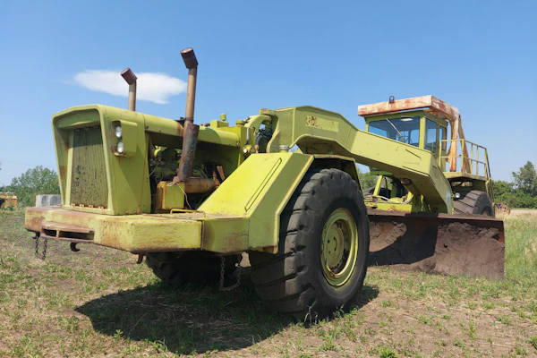
That trade dress design, called “Power Edge” inside Cat, placed the familiar “CAT” logo on a black background with a diagonal red bar. Stembridge says that “Power Edge” is a lasting design that has given Cat machines a “strong visual identity.” However, a lot has changed for Cat in the 12 years since that trade dress design rolled out.

“For one thing we’ve seen just a tremendous increase in the amount of technology that’s in a Cat product,” Stembridge says. “That’s driven some challenges to how we apply the brand to a product. In a lot of cases we have grilles and other features that may not have been there 10 years ago that make it harder to brand the machine and integrate that branding into the machine’s design.”
Another difference in the company driving the need for a change, Stembridge says, is the size of Cat’s product offering. He says the company likely has 30-40 percent more distinct products now than it did when “Power Edge” was released.
But there were also external factors in the redesign, Stembridge says. “We have seen a proliferation of competitors starting to use an imitation of the Power Edge design on their machines,” he says. “The more that happens the more it weakens the association of that trade dress to our brand.”


Stembridge did not say what specific competitors were guilty of such “imitation,” but if you Google around you can find some pretty obvious examples of what he means.
These concerns culminated about 18 months ago in the first discussions inside Cat focusing on when a good time to roll out a new trade dress design might be. The development of that design began in January of this year, Stembridge says, and took about six months.
There were three main goals Stembridge and the “several dozen” Caterpillar employees that took part in development had for the new design. First, Cat wanted it to communicate “the level of technology and capability” found in its new products. Second, it needed to be more modular and adaptive to machines of all different designs and sizes, from mining shovels down to home and outdoor generator sets. Third, it needed to evoke the sense of a premium brand.
To kick off the design process, Stembridge and his team looked to the past for inspiration. “We wanted to steep ourselves in the history of the brand,” he says.
The team also reached out to each product group within Cat to learn what ways the “Power Edge” design could be improved upon.
“As we started coming up with concepts, I asked the team to explore a very wide range of ideas from graphic treatments and how we apply them. We went very wide with those concepts and we would meet and have a critique and throw out the ones that didn’t work,” Stembridge explains.
More than 500 different conceptual designs were generated during the design process, Stembridge says. These were inspired by a central ideation board that featured images of premium brand products, Stembridge says. “Apple computers, Stihl chainsaws, Mercedes automobiles. We looked at how those products are visually represented,” he says. “We basically took the aspects of what we liked about certain brands and treatments they used and we explored that heavily during our own development.”
Slowly, those hundreds of concepts were whittled down to a favorite seven designs among the team. Those seven were then reduced to a final three, from which the winning design was chosen.

The result is what Cat calls “Modern Hex,” and by the end of 2020, it will roll out across Cat’s wide range of products.
Whereas “Power Edge” was distinctive for its simple, high-contrast, flat design, “Modern Hex” is full of character and depth.
The resulting design still prominently features the iconic “CAT” logo, but places it above and diagonal to a 3D, red hexagon surrounding a grille pattern. The Cat logo itself has also received some updating. For this trade dress design Cat has dressed the logo in drop shadows and a silvery shade that give it a three-dimensional, steel-like quality.
Stembridge says this treatment of the Cat trademark was based in the team’s goal for a more premium brand look and feel. He adds that as Cat has showed the new design to people, the 3D effect of the graphics have led them to actually approach and feel the new decals, wondering whether they were physically embedded into the side of the machine.
The steel treatment has also been given to the machine model number, which now sits separate from the “CAT” logo, and even has its own smaller hexagon/grille. This separation is part of Modern Hex’s modularity, allowing more flexibility for where the model number is placed on the machine. “We always want the Cat logo to be the hero image on a machine,” Stembridge says. “But we also want the model number to be the sidekick, if you will.”
And though the new design is primarily focused on bringing the company’s products into the future, the company says it chose to make the hexagon red as a nod its past. The red is the same shade as the wavy “CATERPILLAR” logo found on the company’s first crawler tractors, which were painted gray when they were introduced in 1925.
Though the Cat logo remains the star element of the new design, this new red hexagon is a very close second. But how and why did the hexagon become such a prominent figure in Cat’s new trade dress?
Stembridge says the hexagon has been used in Cat designs since 2006, when the company began using the shape in its radiator grille design on heavy equipment. Over the last decade, the hexagon has slowly built up its influence within the company’s design language, spreading to use as a texture for floor mats and eventually finding its way into the company’s marketing materials.
Up until now though it’s always been used as a texture or a background element.
But the hexagon has become such a common design theme that when tasked to generate concepts for the new trade dress, Cat designers reached, perhaps instinctively, to the shape as a possible complementary element to the Cat logo.
Stembridge liked the idea of the hexagon taking on a more prominent role. “So we said, ‘Let’s own that shape,’” he recalls.
Of course, Stembridge is aware that the design won’t please everyone and says that there are probably a lot of folks out there scratching their heads over “Modern Hex”. However, he isn’t taking any negative first reactions to the design that come his way as a final verdict.
“A new design is always polarizing to folks. We went through that when we introduced ‘Power Edge,’” he says. “Once folks see it out there in the field working, we think that it’s really going to be well received.”