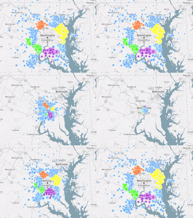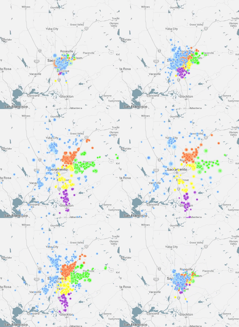
Thanks to data analyst and systems designer Mark Little we now have a pretty good idea, and for commutes all across the U.S. And while we all know commuting in cities like Washington D.C. and San Francisco can be downright hellish, these mesmerizing animations drive the point home a bit further. It’s also a pretty compelling argument for increased infrastructure funding, but I digress.
On his blog I Like Big Bytes, Little writes that his work was inspired by commuter visualizations put together by geographer and urban planner Alasdair Rae. After publishing his visualizations, Rae mentioned the idea of creating a version that would allow users to zoom in on any part of the U.S. and see a visualization for that region’s commute.
Using, data from the American Community Survey, Little has done just that.

We’ve included a couple of sample gifs in this post, but you can view visualizations for any county in the U.S. It’s a pretty impressive project.
“The actual map is done using the Google Maps Javascript API with a transparent div on top where the images of the dots are mapped using CSS (“top” and “left”) and the animation library Velocity to handle the back and forth motion,” Little explains. “The points are sized based on the number of commuters, so a large dot indicates a higher relative number of commuters moving from the same tract to the same tract. The dots are also color coded to see which counties are most represented in the commuter sample.”
Be sure to head on over to Little’s site and check out your area’s commuter visualization.


